How to Create a Website Structure that Generates Leads

Jude Wharton is the co-founder of Ready Steady Websites®, an off the shelf website and membership site template service which, enables small business owners to take control of their online presence and shine online.
Take a read of her incredibly useful advice to help you come up with a solid site map and great structure when you are planning your website.
The Purpose of Your Website
Before you jump straight into creating your website you need to carefully consider your website structure. One of the things that you need to be clear on before you do this is what the purpose of your website is.
Your website should have two purposes, a primary purpose and a secondary purpose. To read more on this, I highly recommend Building a Story Brand by Donald Miller. The primary purpose of your website is the ultimate action you want your website visitor to take. Perhaps this is to buy your product, book a session or join your membership.
Not everyone will be ready to jump straight into taking this primary action so that’s where the secondary purpose of your website comes in. This is an action your website visitor can take that takes them a step closer to the primary purpose. This could be that they join your mailing list by signing up for a free download so you can nurture them; they could join your community or book a free call.
When you are clear about what it is you want your website visitor to be doing when they come to your website, then you can start thinking about the structure of it.
Website Structure
Planning your website structure is key and you need to consider the key purposes of your website and what it is you want your website visitor to do when you plan this.

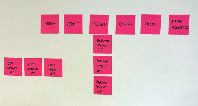
We recommend planning the structure of your website by creating a simple sitemap. The photo above is an example of a website sitemap. A sitemap is basically the pages of your website and how they will be linked together. We always keep it simple and use sticky notes and pens to plan ours.
Three top tips to consider when planning your sitemap are:
- You should have absolutely no more than eight items in the main navigation or main menu of your website, a maximum of six is even better. This is so your menu doesn’t look cluttered and also so you aren’t giving your website visitor too much choice. You want to guide them into taking one of the actions that means the purpose of your website has been achieved. You don’t want them getting distracted.
- It should take no more than three clicks for your website visitor to take action. You don’t want your website visitor getting lost in a rabbit warren of pages. All the key information should be within three clicks of the homepage on your website. So, based on the sitemap above, if the website visitor likes what they see on the home page and decides to click on Products (click 1), they have a look around the Products overview page. Awesome Product #2 looks good to them, so they click on that (click 2). They like the look of the product after reading the detailed information and click the “Buy Now” button (click 3). This is what you are aiming for on your own website – making it really simple for your website visitor to take action.
- Make the menu item furthest to the right one that supports the purpose of your website. Your website visitor’s eye will naturally be drawn to the far right of the page early on. So having a key action up there like contact, free resources or book a call is a great way to capture a lead.
Page Layouts
Once you have planned the pages you need on your website and how they are all going to link together, then you need to consider the layouts of each of your pages. Again, this needs to be planned. Don’t just start chucking content into a website template. It will end up looking cluttered and confusing.
You may have heard the phrase “Content is King”. That comes from the fact that you should have your content written and planned before you start designing the layout of your website pages. Don’t try to design first and cram the content in after. Know how much content you have and which key messages you want to highlight and design around it. This is why we ensure our website templates are so flexible so that you don’t have to stick to a fixed layout.
There are a lot of tips I could give you around page layout but some of the key ones are:
- Use white space. Now this doesn’t have to be literally white but leave space between sections of the page so that it doesn’t seem cluttered. This makes it easier for your website visitor to skim the page and let their eye settle on what they are looking for.
- Use good visual hierarchy. By this, I mean make the most important headings bigger and reduce them in size with importance. Make sure this is consistent throughout the website because then as your website visitor moves around the website their eye will naturally be drawn to the most important things.
- Use the space above the fold effectively. “Above the fold” is the top of the web page that your website visitor can see before they scroll. This area is important on all pages and especially the home page. On the home page, you should have an engaging statement that shows what it is you do and the benefits, so your website visitor knows immediately that they are in the right place. Then, below this statement you should have at least once call to action button but preferably two, which reflect the primary and secondary purpose of your website. This makes it really easy for people to take action, especially if they are a return visitor to the website. On all other pages, above the fold it should be clear what the page is about, with a call to action, if appropriate.
- Make sure your above the fold content can be seen above the fold on all screen sizes. It is likely that most people will be visiting your website for the first time on a mobile device, so they need to have a great experience.
Include Call to Actions in Blogs
Your website visitor may not always hit the homepage of your website first. It’s likely that they will come across a blog post if you have one (which you should!). This is why you should include some kind of call to action in all your blog posts which brings them into your website. It may be for them to read another relevant post. You may suggest they check out one of your free resources that’s relevant to the blog post or that they visit your about page or services page to find out more about you or what you do.
You need to use these blog posts in the same way as any of your pages, to bring your website visitor into the flow of your website. It’s great that they’ve found you, don’t let them go easily!
If you would more guidance and support around getting your website structure right, then take a look at The Website Blueprint download (using Kate’s referral link) that we have created.
By Jude Wharton from Ready Steady Websites
Like the sound of a Ready Steady Website website – well, you’re looking at one!
I worked with Jude (and Chris) to create my website and absolutely adored the flexibility to use their templates to make the website my own (and learn so much in doing so), but having their support if I had questions or needed quick fixes.
If you need a new website and like the sound of all that Ready Steady Websites can offer – the Perfectly Planned Website Course is a great place to start. Use my special referral link to get started today: